Picasso Baby
Yesterday afternoon, I read an excellent piece from “Die, Workwear!” about The Studio Artist Look. Since Spring is finally in the air - and isn’t faking out on us this time - people are wearing breezier clothes again. Gone are the excess layers that define winter wardrobes, giving way to louché striped shirts and unstructured shoes, both leather and suede. Though this look has been favored by intellectuals and creatives for a long time, it’s beginning to hit the runway in the form of pleated trousers, blousing - yet not baggy - button-downs and spattered clothes. Derek Guy from "Die, Workwear!" even found a vintage paint-splattered military shirt that sold for over $300, though I'll stick to less expensive garments I can distress myself, thank you very much.
In addition to the likes of Andy Warhol and David Hockney, the piece’s main reference point was Pablo Picasso. Picasso looked the part of his art, ever the randy dandy in his loose-fitting ensembles. Much like his subjects, the proportions seemed just right on Picasso. Though he was a slight man, he wore wide-legged trousers with flair, and sported a Terry-Cloth polo better than anyone beside James Bond - who was a fictional character! Even in his most intense and busy moments, Picasso always looked at leisure, a tad disheveled but never dilapidated.
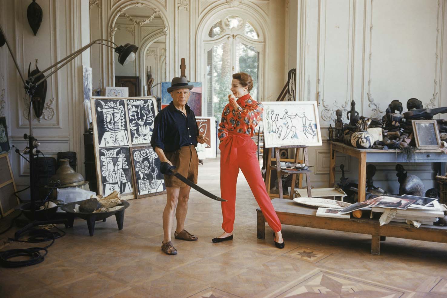
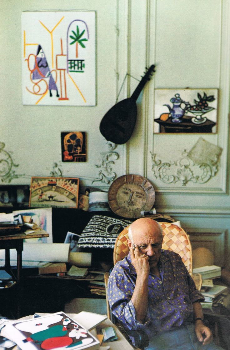
The shots of Picasso’s style featured on “Die, Workwear!” were mostly set against the interior of La Californie, the artist’s manor home and studio in his late years. This led me to dig out one of my favorite volumes of Apartamento, issue #16 which features a 24-page spread on La Californie. Much like its owner, La Californie was kept in a luxurious state of disarray. High ceilings, classic arches and ornate pillars were tempered by the illustrious mess caused by Picasso’s creations. Room after room was strewn with the detritus of works in progress and works abandoned, artists materials and intentful bric a brac. Even the neatest rooms were filled to the brim with fine antique furniture and curios, decorated with art by the master himself, not limited to his paintings but also sculptures and engravings. The waning tides of minimalist interior decor are in part thanks to the resurfacing of images of dwellings like Picasso’s, places that look jarring - even messy - at first, but at a closer glance reveal considered curation in their seemingly haphazard assembly.
Perhaps Picasso’s ease in dress and decor comes from his innate eye for patterns, lines and designs. These elements, however, seem too mish-mashed to be unintentional and careless. Like his art, Picasso’s life was a study of the obtuse, finding elements that seemed disparate - whether the human face and geometric shapes, Breton-striped sailor shirts and plaid pants and old mansions and clutter - and combining them to create a new mode of expression that at first seems strange but becomes entirely natural after the viewer sits with it. Such is the effect of great art and its ability to unsettle the audience on their first view - it contains separate factions charged enough to create an emotional response, which keeps their attention until they begin to change their minds. And whether you like or dislike Picasso's work, it's impossible not to pay attention to his art, his look and his mastery of interior design.

