The Accessibility of Art
The problem with art is that it is difficult for the public sphere to access. Accessibility, in this sense, is not due to economics; many art museums are free to the public (or host weekly free admission nights) and make it their mission to make art available to all. Art's problem with accessibility is related to its dependence on theory, on intellectualizing each piece's meaning to no end. All art has meaning, no doubt, and often multiple layers of meaning, but art also has value in its most straightforward state.
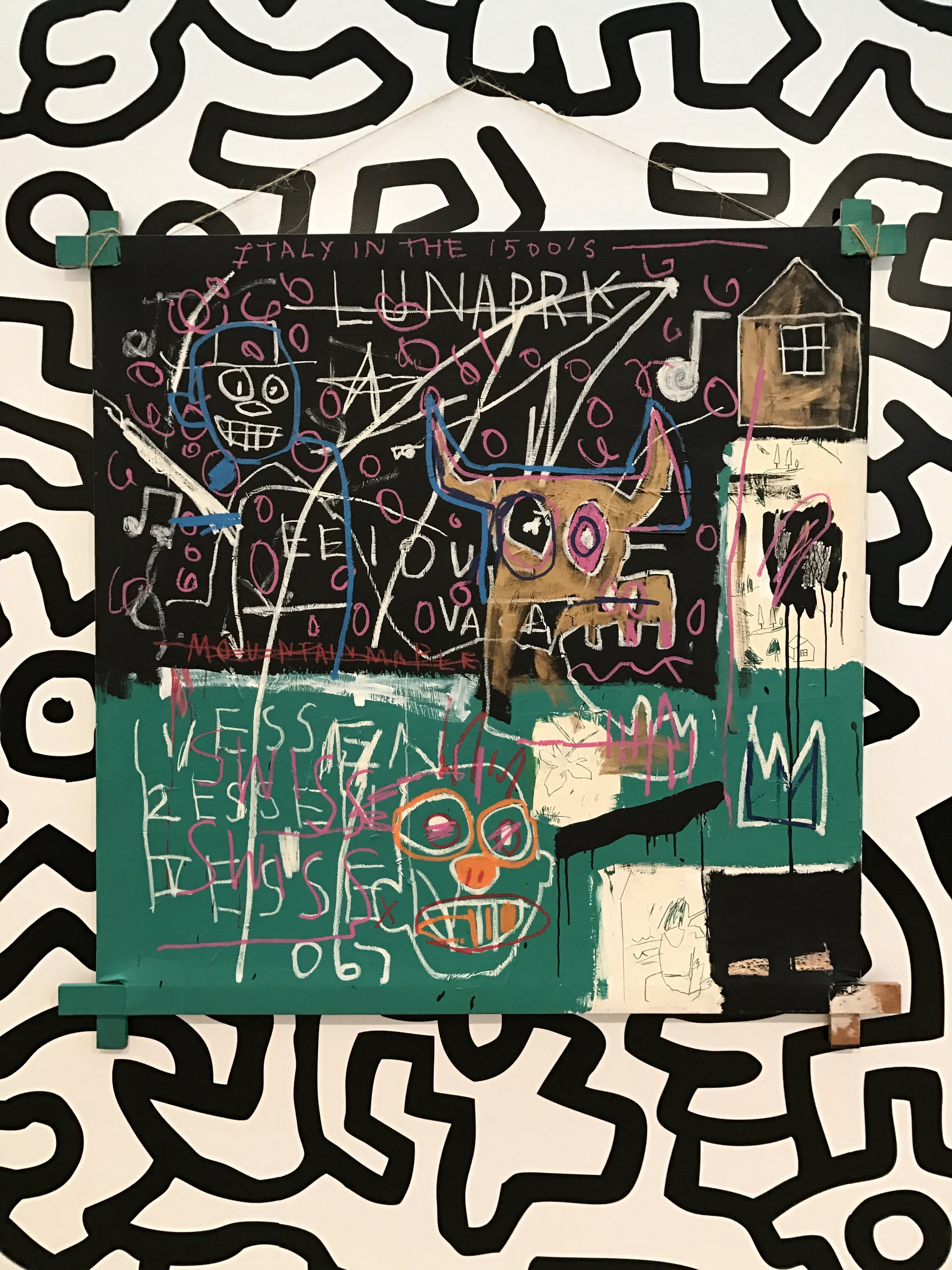
Jean-Michel Basquiat, "LNAPRK."
In a recent article on the Whitney Biennial, by art critic Jerry Saltz, he applauded the fact that the essays in the catalog and plaques describing the paintings were free of the dense, theoretical terminology that makes them - and therefore art - difficult to understand. On the exhibition, Saltz noted that "Not one essay quotes any of the usual postmodern theoretical suspects for authority. Indeed, these curators risk getting kicked off Theory Island in their essays talking about “earnestness, honesty, not being ironic but being sincere, spirituality, personhood, intimate relationships, not being motivated by careers, and a certain modesty or humility.” One even quotes Emerson. Take it from someone who’s spent accumulated alienated months trying to read densely worded wall labels and heady essays, these biennial cattle calls don’t usually roll this way. I love it." This year's Whitney Biennial - which I haven't seen yet - features a diverse roster of artists who represent the makeup of modern painting, sculpture and photography more accurately than the permanent collections and rotating exhibits at similar museums. At least half of the artists are women or people of color, and none are the rock star artists who coast on reputation. Instead of glitz and glamour, the Biennial features provocative, conscious and accessible work that - while benefitting from theoretical analysis - doesn't need it to be understandable. Many of the selections - such as Henry Taylor's heartbreaking painting "The Times Thay Aint a Changing Fast Enough!" that depicts the death of Philando Castile, who was shot by police in the Twin Cities last July - deal with modern issues that dominate the news media or are encountered as a part of everyday life, thus the average patron is able to relate to the piece. This is not art dumbed down, rather it is the result of a new vanguard attempting to democratize creativity and break down traditional barriers of access. The strength of the images alone hold significant, powerful meaning that stops viewers in their tracks, a meaning that engages profound thought and emotion from the casual art observer and the seasoned art appreciator more than any analysis ever will.
Don't get me wrong. Theory is great, if you take the time to learn how to understand it. Reading theory is a good way to acquaint oneself with the complex relationships between art and culture. However, understanding theory is an art of its own, and without knowing its language, it's difficult to comprehend the symbolism in art because art deals with abstract concepts and leaves much up for interpretation, which most theorists take as an opportunity to make as complex as possible. Though symbolism lends deeper meaning to art than taking it at face value, sometimes the pursuit of art for art's sake - to create something beautiful or resonant - is more important than how the piece is analyzed. This is what Saltz - one of the few successful modern art critics for this reason - gets at with his diatribe against the constraints of theory; by presenting art that engages with the set of emotions familiar to both the casual viewer and the art aficionado, and presenting it in mediums and terms both groups understand, the public as a whole is more engaged with and curious about the art they encounter.
As art has become more spreadable, however, its definition has expanded. Newer forms of art are considered more accessible than classic forms because they are less academic, but no less valid in their merit of the term. Photography is now an art form, an idea people would have scoffed at 75 years ago. Street art has gone highbrow, and graffiti and public art - which are sometimes interchangeable - are the most accessible way to see art and develop artistic talent in terms of economics. Take Jean-Michel Basquiat, for instance, who started his career as the graffiti artist Samo. Basquiat's graffiti sensibilities found their way into his paintings and helped the general public - and to some extent the art world - accept graffiti as legitimate. Now, graffiti can be found everywhere from city-commissioned murals to elaborate restaurant interiors, and is seeping its way into museum exhibitions. Case in point: I saw Basquiat's 1982 painting "LNAPRK" at the Whitney in February. Set against a Keith Haring background for the exhibition "Fast Forward: Painting From The 1980s," the painting was Basquiat's reaction to an amusement park he visited in Italy. The other references of the painting play upon the theme of amusement, but it's his signature crown - in the lower right-hand corner - that he developed as Samo which connects the painting back to street art, and Basquiat's fonts and drawings echo the no-frills look of the graffiti tags of New York's golden age of grit in the 1970s. I noticed that more viewers meditated on the Basquiat than on any other painting in the exhibition, since it takes a theme woven together through complex ties and simplifies it through a medium derived from graffiti. At this rate, I wouldn't be surprised to see a complete graffiti piece in the museum twenty years from now. That's democratization indeed.
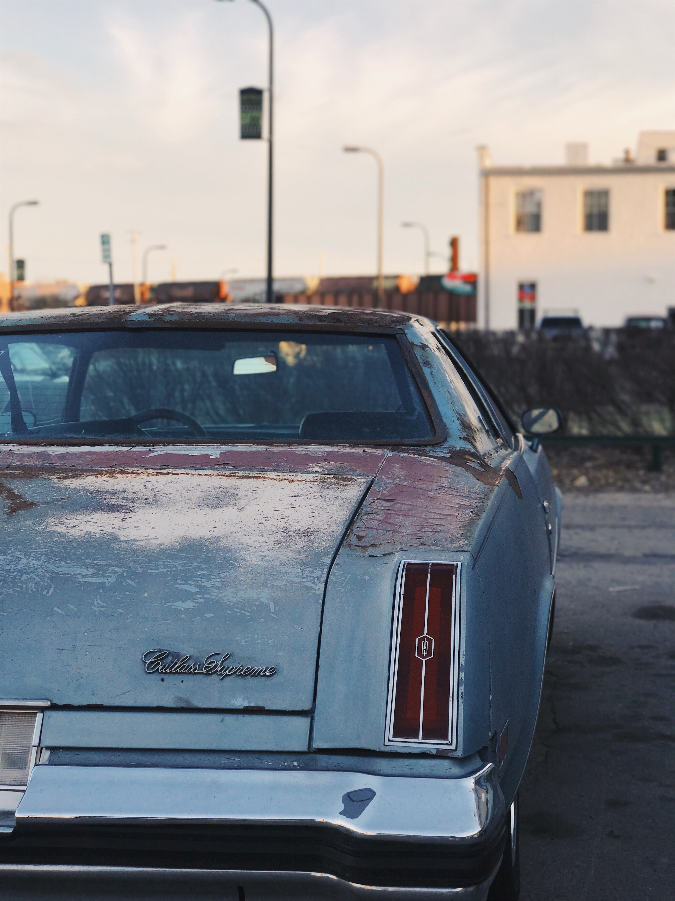
I see and access art everywhere, not just in museums but on the street. Two nights ago, I walked down Central Avenue in Northeast Minneapolis and found art everywhere I looked. Looking through a fence, I saw the sunset illuminating an art studio, framed as if it were a portrait. One block north, I found a Oldsmobile Cutlass Supreme from the mid-1970s parked in front of an auto shop, with beautiful patina to boot. Nearby was a vintage coffee shop sign, and a train passed by in the background; these three unrelated objects created a visual triangle that set the scene for a photograph. One block south, I spotted a vintage diner sign, seemingly untouched since the 1950s, sitting directly beneath the moon and a patch of clear blue evening sky, a scene that conjured up a sense of Americana that I never experienced in my lifetime. Perhaps these photographs are not art in its most theoretical sense (and I'm not putting my photographs in the same league as Taylor's or Basquiat's oeuvre), but their subjects possess an artistic quality and a public visibility that beg for representation. All it takes to access them is the willingness to see and to reconsider - and keep democratizing - the definition of art.

